

Two-tone works when your kitchen has a structural reason for the break – an island, a defined lower run, a ceiling that needs visual lifting. One color works when the room is small, the sightlines are broken, or the architecture is already doing the talking. That is the honest answer, and it has almost nothing to do with which look is trending.
Most articles on this subject pick a side. This one will not, because the correct choice is a property of your room, not of the trend cycle. Below is what current renovation data shows, where each approach outperforms the other, the failure modes nobody warns you about, and a framework you can apply to your own floor plan.
At Prestige Cabinet, we design and build both 2 tone kitchen cabinets and single-color schemes every week across our Santa Ana and Laguna Niguel showrooms. We have also been called in to fix both. The patterns are consistent enough to be worth writing down.
What Are 2 Tone Kitchen Cabinets, Exactly?
A two-tone kitchen uses two distinct cabinet finishes in the same room. That is the whole definition – but the definition hides how much variation sits underneath it, and most disappointing outcomes trace back to choosing the wrong type of two-tone rather than to choosing two-tone at all.
The Four Ways a Two-Tone Kitchen Actually Gets Executed
Upper and lower contrast. Light wall cabinets over darker or warmer base cabinets. This is the configuration most people picture, and it is the one with the strongest data behind it.
Island as the accent. Perimeter cabinetry in one finish, island in another. This is the lowest-risk version of two-tone because the island is already a separate object in the room. The eye reads it as furniture, not as an interruption.
Zone-based contrast. The range wall, pantry, or beverage station gets its own finish while everything else stays uniform. Common in larger kitchens where a single continuous color would read as institutional.
Material contrast, not color contrast. Two finishes at similar lightness but different materials – a matte painted surface against a natural wood veneer, for instance. This is the most sophisticated version and the hardest to specify, because it depends on texture and undertone rather than obvious color difference.
These are not interchangeable. An island accent in a 90-square-foot galley is a different proposition from upper-lower contrast in a 250-square-foot open plan, and lumping them together is how homeowners end up with a result they did not expect.
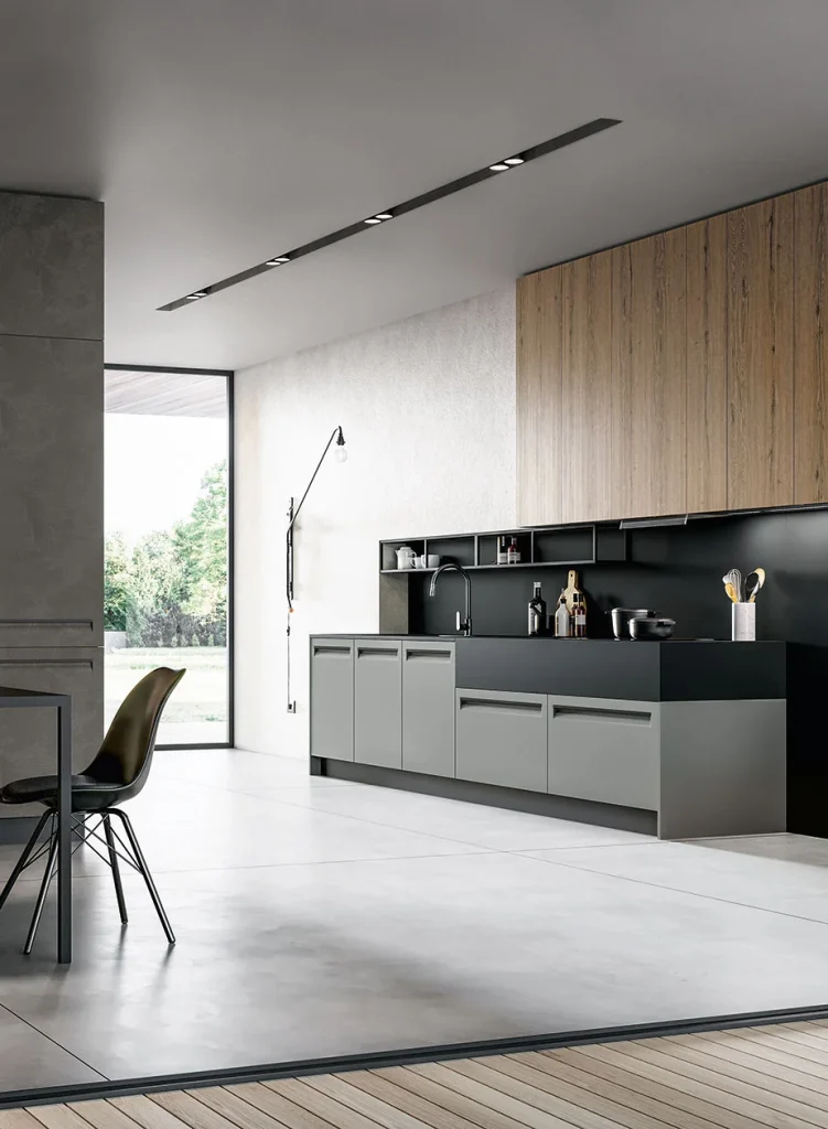
What the Data Says About 2 Tone Kitchen Cabinets Right Now
2 tone kitchen cabinets are neither a fringe choice nor the default. They sit in a meaningful minority.
According to the 2026 U.S. Houzz Kitchen Trends Study, nearly a quarter of renovating homeowners (24%) choose contrasting upper and lower cabinets. The study surveyed 1,780 U.S. homeowners and was fielded in July 2025. That figure is worth sitting with: roughly three in four renovating homeowners still choose a single cabinet color. Two-tone is a considered minority position, not a bandwagon.
The color pairings are also more predictable than the design press suggests. Among homeowners choosing contrast, white leads for upper cabinets at 40%, followed by off-white at 19% and wood tones at 17%. For lower cabinets, wood finishes top the list at 37%, with blue at 19% and green at 14%; black (7%) and gray (6%) are the least common choices for contrasting lowers.
Read that carefully. The dominant two-tone kitchen in America right now is light-on-top, wood-on-bottom – not the dramatic black-and-white contrast that fills Pinterest boards. Black lowers appear in a small fraction of contrast kitchens.
There is a second, quieter form of contrast worth noting. One in five homeowners (21%) choose a different countertop surface for the island than for the main runs, and butcher block or wood slab now leads that category at 44%, up 13 percentage points year over year. Contrast is migrating toward the island and toward material rather than paint.
The background context matters too. Wood has overtaken white as the top overall cabinet color, chosen by 29% of renovating homeowners against white’s 28%, with medium wood tones leading at 15%. This reframes the two-tone question. The interesting comparison is no longer “white kitchen versus two-tone kitchen.” It is increasingly “all-wood kitchen versus wood-and-paint kitchen.”
The Honest Case for 2 Tone Kitchen Cabinets
2 tone kitchen cabinets get defended on aesthetic grounds. The stronger arguments are architectural.
It Solves Real Problems With Visual Weight
Rooms have a center of gravity. A kitchen finished entirely in a dark color feels top-heavy, because the wall cabinets sit at eye level and press inward. A kitchen finished entirely in a pale color can feel weightless and slightly unmoored, particularly with light flooring.
Putting the darker or warmer finish on the base cabinets and the lighter finish above resolves this. Weight sits low, where weight belongs. The room reads as grounded. This is why light-over-wood dominates the data – it is not fashion, it is a solution to a perceptual problem that most kitchens have.
The same logic applies vertically. In a room with a standard eight-foot ceiling, running a lighter finish on the uppers and carrying it to the ceiling makes the wall cabinetry recede, which makes the ceiling feel higher than it measures. A single dark color throughout does the opposite.
It Lets You Spend Money Where It Shows
This is the argument we make most often in the showroom, and it is rarely discussed publicly.
Premium materials – figured veneers, specialty lacquers, exotic species – carry a cost per linear foot. Applying them to an entire kitchen is expensive. Applying them to an island, a range wall, or a bank of base cabinets concentrates that spend in the place the eye lands first.
The Houzz study puts the median spend for a major kitchen remodel, where all cabinets and appliances are replaced, at $55,000, rising to a median of $75,000 for kitchens of 250 square feet or more. Within a fixed budget, a two-tone strategy is often what makes a genuinely premium material achievable at all. One color forces an all-or-nothing decision on material grade.
It Defines Zones in Open-Plan Homes
In an open floor plan – common in Orange County new builds and remodels – the kitchen has no walls to distinguish it from the living space. A change in cabinet finish at the island does structurally what a wall used to do. It says this is the kitchen and that is not, without building anything.

The Honest Case Against 2 Tone Kitchen Cabinets
Now the other side, stated as plainly.
Small Kitchens Usually Lose
Contrast creates a visual boundary. Boundaries divide space. In a kitchen under roughly 100 square feet – and 12% of renovated kitchens fall under 100 square feet – dividing the space is exactly the wrong move. The room will read smaller and busier than it is.
A single continuous finish lets the eye travel uninterrupted from one wall to the next, which is the primary tool available for making a compact kitchen feel larger. This is not a preference. It is close to a rule.
Broken Sightlines Compound the Problem
Cabinet finish is only one variable. Your kitchen already contains a refrigerator, a range, a hood, a window, a doorway, and a backsplash. Each is a visual interruption. Add a deliberate color break to a room that already has six unplanned ones and the result is noise, not design.
Before committing, stand at the main entry and count the visual breaks in your run of cabinetry. If the count is high, a single color is doing necessary quiet work.
The Coordination Burden Multiplies
One color requires you to get one relationship right: cabinets to countertop. Two-tone requires you to get several right simultaneously – upper to lower, each finish to the countertop, each to the backsplash, each to the flooring, and both to the hardware.
Undertone is where this breaks. A warm white and a cool gray-brown wood are each attractive alone and slightly wrong together in a way most people can feel but cannot name. Two-tone has a higher skill floor. Executed well it is superior; executed adequately it is worse than a well-chosen single color.
Trend-Led Contrast Dates Fastest
Two-tone kitchens built around a specific fashionable pairing age at the speed of that pairing. The greige-and-white kitchens of the mid-2010s are a live example. Two-tone kitchens built around an architectural rationale – grounding weight, lifting a ceiling, defining an island – age at the speed of the architecture, which is to say slowly.
The question to ask is not do I like this combination but what is this combination doing for the room. If you cannot answer the second question, the combination is decoration and will date.

One Color Kitchens: What You Actually Gain
Single-color kitchens are rarely argued for with any energy, which is strange given that roughly three-quarters of homeowners choose them.
Continuity reads as expensive. An uninterrupted run of cabinetry in a single considered finish signals intent. Much of what people identify as “high-end” in European kitchen design is actually just continuity – long unbroken planes, consistent reveals, one material doing one job well.
It lets other elements lead. If you have a remarkable stone slab, a striking backsplash, an architectural window, or serious millwork, a monochromatic cabinet scheme puts those forward. Two-tone competes with them.
It is more forgiving over time. Repairs, additions, and future matching are all simpler with one finish. Adding a cabinet in five years to a single-color kitchen is straightforward; matching one of two finishes in an aged two-tone kitchen is harder.
Where One Color Is Almost Always the Right Call
- Kitchens under roughly 100 square feet
- Galley layouts, where both runs are visible simultaneously and contrast fights itself
- Kitchens with a dominant feature already competing for attention
- Rooms with limited natural light, where contrast reads as heaviness rather than depth
- Homes with strong architectural character, where cabinetry should support rather than assert
How to Decide: A Framework You Can Actually Apply
Ignore inspiration images for ten minutes and answer these instead.
1. Is there a structural reason for a break? An island, a peninsula, a separate range wall, a genuine change in function. If a break exists in the architecture, two-tone can reinforce it. If you would be inventing the break, reconsider.
2. How much uninterrupted cabinetry do you have? Long continuous runs tolerate and often benefit from contrast. Short, chopped runs do not.
3. What is your ceiling height and natural light? High ceilings and strong light absorb contrast comfortably. Eight-foot ceilings with north-facing light do not, and this is a real consideration in older Orange County homes.
4. What are you asking the cabinetry to do? Lead the room, or support something else? Two-tone leads. One color supports.
5. How long do you intend to stay? A quarter of renovating homeowners (25%) cite improving resale value as a reason to remodel. If resale is a near-term priority, the conservative light-over-wood pairing or a single warm neutral both perform well. If this is a long-term home, design for yourself.
If three or more answers point toward contrast, two-tone is likely correct for your room. If they scatter, one color is the safer and often better outcome.
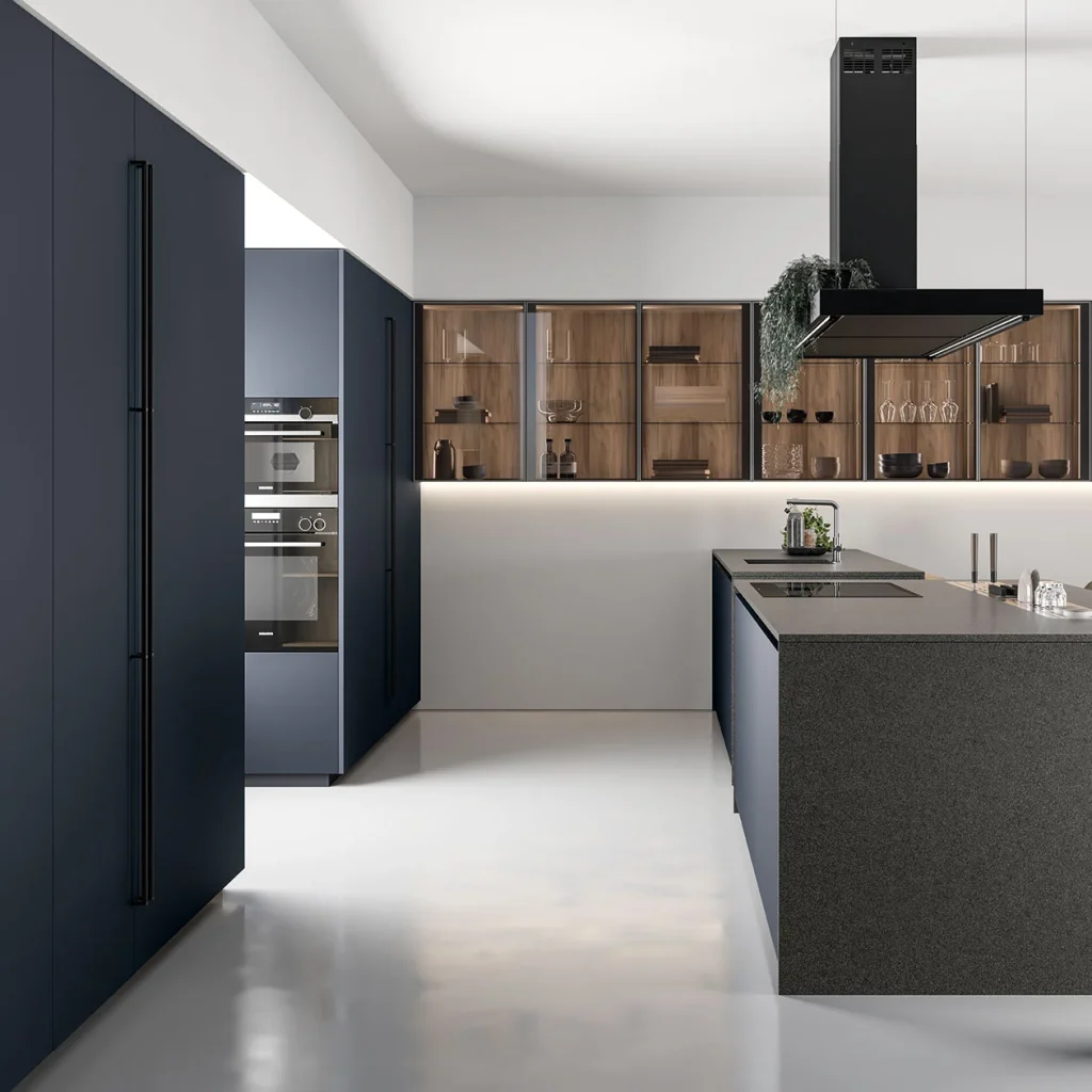
If You Choose 2 Tone Kitchen Cabinets, Get These Details Right
Most disappointments with 2 tone kitchen cabinets are execution failures rather than concept failures.
Match Undertones Before Matching Colors
Every white has an undertone. Every wood has an undertone. The pairing succeeds or fails at that level, well before anyone considers whether they “like” the two colors together.
Evaluate samples in your own kitchen, at the times of day you actually use it, against your real flooring and countertop. Showroom lighting is not your lighting. A warm white that looks crisp under showroom fixtures can read yellow against cool afternoon light through a west-facing window – a common condition in coastal Orange County homes.
Put the Break Where the Architecture Puts It
The color change should land on a line the room already has: the countertop, the island edge, a change of plane, the edge of a range wall. Breaks placed on arbitrary lines look arbitrary, because they are.
Keep One Element Constant
Hardware, door profile, and sheen level should stay consistent across both finishes. When color, profile, and hardware all change at once, the room stops reading as one kitchen. Two finishes sharing one vocabulary reads as intentional; two finishes with nothing in common reads as an accident.
Plan for the Fact That Wood Moves and Paint Does Not
This is the detail almost nobody accounts for, and it is the one we raise most often with clients considering a paint-and-wood pairing.
Painted finishes are colorfast. Natural wood is not. The U.S. Forest Service Forest Products Laboratory notes in its guidance on finishing of wood that unfinished wood surfaces exposed indoors may also change color. Finish systems slow this considerably, but they do not stop it entirely, and species vary widely – walnut tends to lighten, cherry and some oaks deepen.
The practical consequence: a contrast relationship you calibrate precisely on installation day is not fixed forever. The paint will hold; the wood will drift. Choose pairings with enough tolerance that a modest shift in the wood still works against the painted finish, and give any wood element consistent light exposure where possible, since a run half in sunlight and half in shadow will age unevenly.
This is the kind of consideration that separates cabinetry designed to last from cabinetry designed to photograph.
Cost, Materials, and the Questions Nobody Asks
Do 2 tone kitchen cabinets cost more? Modestly, in most cases. The driver is production: two finish runs, two setups, two quality-control passes. On a custom program the premium is usually a small percentage of cabinetry cost, not a different order of magnitude. If a quote shows a dramatic jump, ask what is actually driving it.
Does it affect resale? There is no credible evidence that contrast helps or hurts resale as a category; execution quality drives buyer response far more than the count of finishes. Given that white uppers (40%) over wood lowers (37%) is the most common pairing, that combination is about as market-neutral as a design choice gets.
What about the materials underneath? Worth more attention than color, honestly. Composite wood panels sold in the United States are federally regulated for formaldehyde emissions under TSCA Title VI. Since March 22, 2019, composite wood products – including hardwood plywood, MDF, particleboard, and finished goods containing them – must be labeled as TSCA Title VI compliant. These federal standards are set at levels identical to the California Air Resources Board ATCM Phase II standards. Ask any cabinetmaker to document compliance. All Prestige Cabinet cabinetry meets CARB and TSCA Title VI requirements.
Who should specify it? Professional involvement is nearly universal at the higher end: among homeowners spending $50,000 or more, 98% hire at least one professional and 43% hire a cabinetmaker. Contrast schemes especially reward professional specification, because undertone and break-line decisions are where amateur execution shows.

How Prestige Cabinet Approaches This Decision
We do not have a house position on 2 tone kitchen cabinets versus one color, and we are skeptical of anyone who does.
What we do have is a process. Before any finish decision, we look at your floor plan, your ceiling height, your window orientation, and what the room needs to accomplish. Sometimes the answer is a restrained single tone that lets a stone slab lead. Sometimes it is a wood island against a pale perimeter. The room tells us, and we would rather talk you out of a choice in the showroom than watch you live with it.
Our cabinetry is manufactured in Italy with German-engineered hardware and carries a lifetime warranty, in both modern and classic collections. All materials meet CARB and TSCA Title VI standards. Design consultations are free and include a 3D preview, so you can see contrast decisions rendered in your actual space before committing – by far the most reliable way to settle this question.
Visit us at 650 S Grand Ave in Santa Ana or 23811 Aliso Creek Rd, Unit 160 in Laguna Niguel, and bring your floor plan.
Read more: The Complete Guide to Modern Kitchen Cabinets in 2026
Frequently Asked Questions About 2 Tone Kitchen Cabinets
Yes, though as a considered minority choice rather than a default. Current Houzz research finds 24% of renovating homeowners choosing contrasting upper and lower cabinets. The more meaningful shift is which contrast: light uppers over wood lowers now dominates, while high-contrast black-and-white pairings have become uncommon. Two-tone kitchens grounded in an architectural reason age well; those built purely on a fashionable color pairing date with that pairing.
Darker on the bottom, in nearly all cases. Placing visual weight low grounds the room, while dark uppers at eye level press inward and make a kitchen feel smaller and top-heavy. The data reflects this strongly: white leads upper cabinet choices at 40%, while wood finishes lead lowers at 37%. Reversing the arrangement can work in rooms with very high ceilings and abundant light, but it is an exception requiring deliberate handling.
Usually, yes. Contrast creates a visual boundary, and boundaries subdivide space. In kitchens under roughly 100 square feet, or galley layouts where both runs are seen at once, a single continuous finish is the better choice. If you want variation in a compact kitchen, confine it to one element – an island or open shelving – rather than splitting the main runs.
Modestly, in most custom programs. The cost comes from running two finish processes rather than one: separate setups, separate quality control, sometimes separate lead times. This is typically a small percentage premium, not a different price tier. In some cases contrast actually reduces cost, by letting you apply a premium material to a limited high-impact area instead of the whole kitchen.
Light uppers – white or off-white – over medium wood lowers. It is the most common pairing in current renovation data, it reads as warm rather than stark, and it does not commit a future buyer to a specific saturated color. If you prefer something with more character, blue or green lowers are the next most established options, each appearing in the high teens and low double digits among contrast kitchens (blue 19%, green 14%). Black lowers are the highest-risk choice at 7%.
The Short Version
Neither approach is better than the other. Each is a correct answer to a different room.
Go two-tone when your kitchen has a structural break worth reinforcing, generous ceiling height and light, long uninterrupted runs, and a reason for the contrast that you can state in a sentence. Go one color when the room is compact, the sightlines are already busy, another element deserves to lead, or you want the cabinetry to be quiet.
Whichever you choose, spend your attention on undertone, break placement, material compliance, and how the finishes will age. Those decisions outlive the color question entirely.
Ready to work it out against your actual floor plan? Book a free design consultation with Prestige Cabinet at our Santa Ana or Laguna Niguel showroom.


