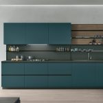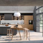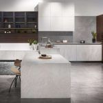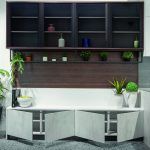
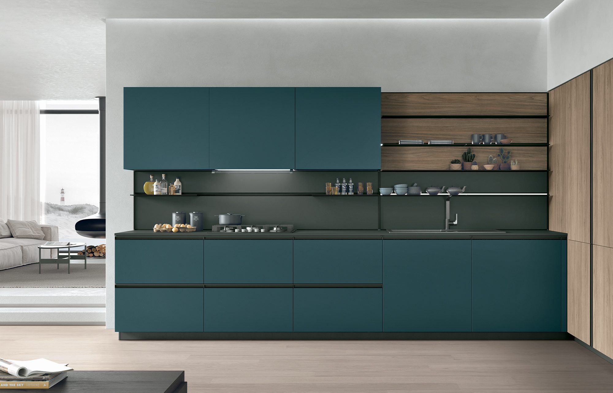
Navy and light blue kitchen cabinets solve different problems. Navy adds depth, contrast, and a tailored, grounded feel, so it works best in kitchens with generous natural light, larger footprints, or a single feature zone such as an island. Light blue reflects more light, opens up compact rooms, and suits relaxed coastal and transitional styles. The right choice depends on four things: how much light your kitchen gets, how big it is, the undertones of your fixed finishes, and how much contrast you want to live with every day.
At Prestige Cabinet, we design and install Italian-made cabinetry for homes across Orange County, and blue kitchen cabinets are one of the color conversations we have most often with homeowners. Blue feels safe enough to commit to and personal enough to make a kitchen feel like yours. Yet the gap between a deep navy and a soft powder blue is enormous, and picking the wrong end of the spectrum is one of the most common color regrets we see. This guide walks you through how each shade behaves, where it works, and how to choose with confidence.
Why Blue Kitchen Cabinets Remain a Lasting Color Choice
Blue has a staying power that few cabinet colors can match. It reads as calm, it pairs with almost every countertop and metal finish, and it bridges traditional and modern design without feeling tied to either.
The industry research backs this up. In the NKBA 2026 Kitchen Trends Report, a survey of 634 kitchen and bath professionals, 96% named neutrals the most popular colors, with greens (86%) and blues (78%) close behind. Blue is not replacing neutrals; it is the color designers reach for when a neutral kitchen needs character.
Homeowner data tells a similar story with an important nuance. As NAR reported from the 2026 Houzz Kitchen Trends Study, blue appears as the main cabinet color in fewer than 5% of remodeled kitchens. But among the nearly one-quarter of homeowners who chose contrasting upper and lower cabinets, blue was the second most popular lower-cabinet color at 19%, behind only wood.
That tells you how blue kitchen cabinets are actually used: often as an accent on lowers, an island, or a single run, paired with white, off-white, or wood. Keep that in mind as you compare navy and light blue, because the “how much blue” question matters as much as “which blue.”
Navy vs. Light Blue Cabinets at a Glance
Before diving into the details, here is a quick side-by-side of how the two shades typically behave:
- Mood: Navy feels tailored, grounded, and dramatic; light blue feels airy, fresh, and relaxed.
- Light needs: Navy needs good natural light or a strong lighting plan; light blue performs well even in modest light.
- Room size: Navy suits medium and large kitchens or a contained zone; light blue helps small and narrow kitchens feel bigger.
- Contrast: Navy creates strong contrast with white counters and brass hardware; light blue offers soft, tonal contrast.
- Styles: Navy works in modern, transitional, and classic kitchens; light blue leans coastal, farmhouse, Scandinavian, and transitional.
- Everyday wear: Navy shows dust, water spots, and fingerprints more readily; light blue hides dust but shows grease and scuffs near handles.
Neither shade is better in absolute terms. Each is better for a specific room, a specific light condition, and a specific way of living. Mid-tone blues, such as denim, steel, or a softened slate, sit between the two and borrow strengths from each, so keep them in mind if neither extreme feels quite right.


Navy Kitchen Cabinets: Depth, Drama, and Timeless Elegance
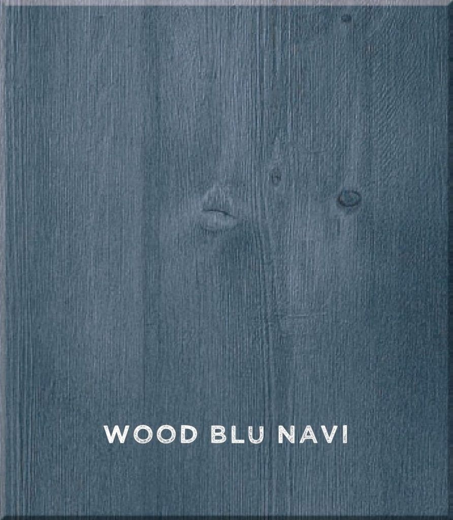
Navy is the blue that behaves most like a neutral. Deep enough to act almost like a softer black, it anchors a room, frames lighter surfaces, and gives cabinetry a crisp, tailored look. Navy kitchen cabinets have appeared in classic kitchens for decades, which is part of why they rarely feel like a passing trend.
Where Navy Blue Cabinets Work Best
- Kitchen islands. A navy island is one of the most common ways to use the color, because it creates a focal point without darkening the whole room.
- Lower cabinets in a two-tone layout. Navy lowers ground the room near the floor while white or wood uppers keep the space bright.
- Large, well-lit kitchens. Rooms with big windows or skylights can carry navy on full perimeter runs without feeling heavy.
- Open-plan homes. Navy cabinetry can read as furniture when the kitchen faces the living area, especially paired with wood tones in the adjoining rooms.
- Classic door styles. The shadow lines of a five-piece door show beautifully against deep color, which is why navy pairs so well with European Shaker kitchen cabinets and inset cabinets.
The Trade-Offs of Dark Blue Cabinetry
Navy asks more of a room than most blue kitchen cabinets do. Dark colors absorb light, so a navy kitchen with limited windows can feel cave-like by late afternoon unless the lighting plan compensates. Deep colors also show dust, water spots, and fingerprints more readily than mid-tones, particularly on flat fronts in high-traffic zones. If you love navy but your kitchen is compact or dim, consider limiting it to the island or lowers and keeping the upper half of the room light.
Light Blue Kitchen Cabinets: Airy, Calm, and Coastal-Friendly
Light blue covers a wide family: powder blue, sky blue, dusty blue, robin’s egg, and soft blue-gray. What they share is a high capacity to reflect light, which makes a kitchen feel more open and relaxed. Light blue kitchen cabinets carry the color’s calm character without the visual weight of a deep shade.
Where Light Blue Cabinets Shine
- Small and galley kitchens. Pale shades push walls visually outward and keep a narrow room from feeling boxed in.
- Coastal and beach homes. Light blue feels at home with sun, sea air, and natural textures, which makes it a natural fit for many Southern California kitchens.
- Kitchens with limited natural light. A soft blue with a higher light reflectance keeps a dim room from feeling gloomy.
- Scandinavian and farmhouse styles. Dusty, gray-leaning blues pair well with pale wood, white walls, and simple hardware.
- Glass-front and display cabinetry. A pale interior or frame behind glass-front kitchen cabinets brightens displayed ceramics and glassware.
How to Keep Light Blue Looking Current
The main risk with light blue is a nursery-like sweetness. Overly saturated pastels can look dated quickly. To keep pale blue cabinets sophisticated, choose shades with a touch of gray or green in them, pair them with natural materials such as stone and wood, and use substantial hardware rather than delicate knobs. Matte or low-sheen surfaces also help pale blues feel more grown-up.
How Light and Room Size Should Shape Your Blue Cabinet Choice
The single biggest factor in choosing between navy and light blue is light. The same blue can look completely different in two kitchens, and even in one kitchen at two times of day. That is why we never recommend selecting blue kitchen cabinets from a screen or a showroom alone.
Use Light Reflectance Value (LRV) as Your Starting Point
Most paint and finish manufacturers publish a light reflectance value for each color on a scale of 0 to 100. A low number means the color absorbs most of the light that hits it; a high number means it bounces light back into the room. Navy shades sit at the low end of the scale, while light blues sit much higher. Treat LRV as a quick filter: if your kitchen is small or dim, favor blues with a higher LRV; if it is bright and spacious, a low-LRV navy can look rich rather than heavy.
Consider Which Way Your Kitchen Faces
Window orientation changes how blue cabinet colors read throughout the day. In the Northern Hemisphere, north-facing rooms receive cooler, indirect light that can make blue look grayer and colder, so warmer blues with a hint of green tend to hold up better. South-facing kitchens receive warmer, brighter light for much of the day, which flatters both navy and light blue. East- and west-facing rooms shift dramatically between morning and evening, so test samples at both times before deciding.
Match the Blue to Your Light Bulbs
Artificial light matters as much as daylight, especially for navy. The U.S. Department of Energy notes that lower color temperatures of 2700–3000 K read as warm, higher ones read as cool, and 2700–3600 K is generally recommended for most indoor general and task lighting. It also recommends a color rendering index (CRI) of 80 or higher for most homes. Warm bulbs can push blues slightly toward green or gray, while cooler bulbs intensify blue. Choose the bulbs before you finalize the cabinet color, and view samples under them.
What We See in Southern California Kitchens
Orange County homes often have abundant, bright daylight, and that changes the navy-versus-light-blue equation. Strong sun can wash out very pale blues, making them read almost white at midday, while the same light lets navy show its full richness instead of turning black. In coastal homes with large windows, a mid-tone or dusty blue is often the sweet spot. In inland homes with deep overhangs or covered patios that shade the kitchen, lighter blue kitchen cabinets usually keep the room brighter from morning to night.
Small Kitchens vs. Open-Plan Spaces
In a compact kitchen, light blue usually wins, or navy can be limited to the lower cabinets. In an open-plan home, consider sightlines: navy cabinets visible from the living room become part of that room’s palette, so coordinate them with sofas, rugs, and flooring. Under-cabinet and interior cabinet lighting help either shade; NKBA respondents expect both to be popular, at 82% and 72% respectively.

Undertones: The Detail That Makes or Breaks Blue Cabinet Colors
Two blues that look identical on a small chip can clash once they are on a full wall of cabinets. The reason is undertone, the subtle secondary hue inside every blue.
Green-Leaning Blues
Teal-adjacent navies and blue-greens feel earthy and relaxed. They pair beautifully with warm wood, brass, and creamy whites, and they hold up well in cool north light.
Gray-Leaning Blues
Slate, dusty, and blue-gray shades feel quiet and sophisticated. They are the most forgiving option for light blue kitchen cabinets and suit modern and Scandinavian kitchens.
Violet- or Red-Leaning Blues
Classic, saturated navies with a slight purple cast read crisp and formal. They look striking with bright white and polished nickel but can clash with warm, yellow-toned stone or wood.
How to Read Undertones Correctly
Compare blue samples side by side against a pure white sheet of paper, and hold them next to your countertop, flooring, and backsplash samples. The undertone that becomes obvious in that comparison is the one that will dominate the finished room.
Pairing Blue Kitchen Cabinets With Countertops, Hardware, and Wood
Blue is versatile, but the best kitchens treat the cabinet color as part of a palette rather than a standalone choice.
Countertops and Backsplashes
- White and off-white quartz or marble give navy maximum crispness and keep light blue fresh.
- Warm-veined stone or quartzite softens navy and balances its formality.
- Soapstone or dark honed surfaces create a moody, tonal look with navy, but need plenty of light.
- Handmade or zellige-style tile adds texture behind light blue cabinets without competing with them.
Hardware Finishes
Hardware changes the personality of blue cabinetry more than almost any other detail. Brushed or unlacquered brass warms navy and makes it feel classic. Polished nickel and chrome keep both shades crisp and modern. Matte black adds graphic contrast to light blue but can disappear against navy. If you prefer a seamless look, handleless kitchen cabinets let the color itself become the statement.
Wood Tones
Wood is the most reliable partner for blue cabinet colors. Light oak with navy is one of the strongest current combinations, balancing warm and cool. Walnut adds richness to pale blue. Open shelving, an island top, or a run of wooden kitchen cabinets can introduce wood without diluting the blue.
Two-Tone Kitchens: Using Navy and Light Blue Together
You do not always have to choose. Many of the most successful blue kitchen cabinets appear in two-tone designs, where navy and a lighter tone share the room.
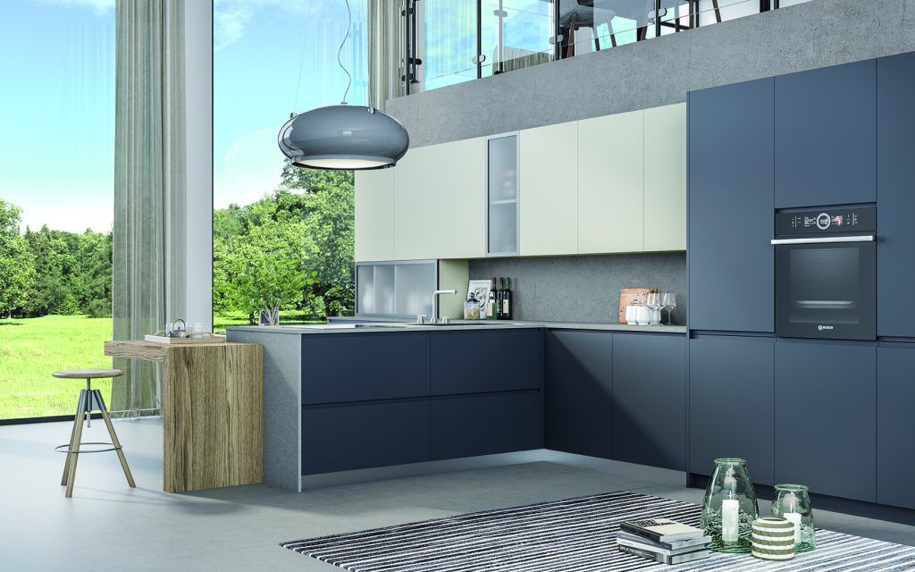
- Navy island, light perimeter. A navy island with white, off-white, or pale blue perimeter cabinets is the classic approach and the easiest to live with.
- Navy lowers, light uppers. Weight sits low, the ceiling feels higher, and the room stays bright.
- Light blue lowers with wood uppers or open shelves. A softer, Scandinavian-inspired take.
- Tonal blues. Pairing a mid-blue with a paler version of the same hue creates depth without high contrast.
Keep to two cabinet colors plus one wood or metal accent so the palette stays intentional. Our two-tone kitchen cabinets page covers proportions and pairings in more depth.
Finish and Sheen: How the Surface Changes the Shade
Finish affects how color reads as much as the color itself. A matte or low-sheen finish absorbs a little more light, making navy look velvety and helping pale blues feel soft and modern; see our matte kitchen cabinets page for how these surfaces perform. A high-gloss lacquer reflects light, which brightens navy and gives light blue a crisp, contemporary edge, but it also shows smudges more readily. Door style matters too: flat slab kitchen cabinets show blue as one uninterrupted plane, while framed and recessed-panel doors add shadow lines that deepen the color.
Living With Blue Kitchen Cabinets: Durability and Everyday Care
Both shades are practical when they are built and finished properly, but they show wear differently.
- Navy reveals dust, flour, water spots, and fingerprints, especially around handles and on lower drawer fronts. Wipe high-touch areas regularly with a soft microfiber cloth.
- Light blue hides dust well but can show grease, cooking splatter, and scuffs near the range and trash pull-out.
- For both, clean with warm water and a mild, pH-neutral soap, then dry the surface. Avoid abrasive pads, ammonia-based sprays, and harsh solvents that can dull the finish.
- Factory-applied finishes generally hold color more evenly and resist wear better than site-applied paint, so ask how and where the cabinets are finished.
Plan the toughest-wearing finish for the zones that take the most abuse: the sink base, the dishwasher surround, and the drawers nearest the cooktop. Well-built blue kitchen cabinets with sealed edges and quality hinges and runners will keep their color and alignment far longer than the paint alone would suggest.
How to Choose: A Simple Decision Framework
If you are still torn, these questions usually settle it.
Choose navy kitchen cabinets if:
- Your kitchen gets strong natural light or you are planning layered lighting
- The room is medium to large, or you will use navy on a contained zone such as an island
- You want bold contrast and a tailored, classic, or modern look
- You are pairing the cabinets with brass, white stone, or light wood
Choose light blue kitchen cabinets if:
- Your kitchen is small, narrow, or short on windows
- You want a calm, airy, coastal, or Scandinavian feel
- You prefer soft, low-contrast transitions between surfaces
- You plan to repeat blue in tile, textiles, or adjoining rooms
Before you commit, test properly. Order large door samples rather than small chips, place them vertically where the cabinets will go, and check them in the morning, afternoon, and evening under your actual bulbs. A sample viewed for a full day is the most reliable predictor of how blue kitchen cabinets will look once installed.
Frequently Asked Questions About Blue Kitchen Cabinets
1. Are blue kitchen cabinets a timeless choice or a passing trend?
Blue has appeared in kitchens for generations, and deep shades such as navy behave almost like a neutral, which helps them age well. Industry research supports its staying power: NKBA’s 2026 report ranks blues just behind neutrals and greens in popularity. Pairing blue with classic materials such as white stone, wood, and brass makes it even more enduring.
2. Do navy cabinets make a kitchen look smaller?
They can if the room is small and dim and navy covers every surface. In a well-lit kitchen, or when navy is limited to an island or lower cabinets, it adds depth without shrinking the space. Keeping the walls, uppers, and countertops light balances the darker color.
3. What wall color goes best with navy kitchen cabinets?
Warm whites and soft off-whites are the safest and most popular choices because they provide clean contrast without feeling stark. Light greige also works well, while pale blue walls can create an elegant tonal scheme. Test wall samples next to your cabinet sample under your own lighting before deciding, and check them again in the evening, when warm bulbs can shift both colors noticeably.
4. Which countertops pair best with light blue kitchen cabinets?
White or off-white quartz and marble-look surfaces keep light blue fresh and bright, while warm-veined quartzite or butcher block adds contrast and warmth. Choose a countertop whose undertone complements the cabinet: gray-leaning blues pair well with cool stones, and green-leaning blues pair well with warmer materials.
5. Do blue cabinets affect resale value?
There is no reliable data showing that a specific cabinet color raises or lowers resale value on its own. Overall kitchen quality, layout, and condition matter far more. Classic, versatile shades such as navy or a soft gray-blue, combined with high-quality construction, are more likely to appeal to a broad range of buyers than a highly saturated or unusual blue.
Design Your Blue Kitchen With Prestige Cabinet
Choosing between navy and light blue comes down to light, space, undertone, and how much contrast you want in your daily routine. Navy brings depth and tailored drama; light blue brings openness and calm. And with a two-tone design, you can have both. You can see how finished kitchens come together in our project gallery.
Prestige Cabinet designs Italian-made cabinetry in hundreds of finishes, built with German-engineered hardware and backed by a lifetime warranty. Visit our Santa Ana showroom at 650 S Grand Ave or our Laguna Niguel showroom at 23811 Aliso Creek Rd, Unit 160, to see blue kitchen cabinets in real light. Or book a free design consultation, and our designers will help you find the shade that fits your space before anything goes into production.